SME Consulting — measured, not asserted
A second pass after the client's verdict: “it still looks like AI slop.” He was right. This record documents what was skipped the first time, what independent critics found, what changed, and — importantly — what did not improve.
https://sme-fix.vercel.app/ →01 — Root causeWhat went wrong the first time
The first pass improvised a lookalike of the AI Design System: it borrowed two tools (render-measure, qa_gate) and skipped every station that produces taste. Critically, the builder was also the critic — self-graded throughout.
| Station skipped | Consequence |
|---|---|
| Art-direction pack | Blessed references, extracted tokens and graded imagery are mandatory before any build. Going words → artifact in one hop is the documented cause of generic output. |
| Independent lenses | No Gemini vision, no Tastemaker, no cross_critic, no design-critic corpus. The only reviewer was the author. |
| Signature motion | Zero motion shipped. Scroll-fade-only is an automatic send-back under the system's own rules. |
| Grounded corpus | The single query run returned “I don't have grounded information on this” — and the build proceeded anyway. |
02 — Independent diagnosisTwo lenses, no coordination, same verdict
Gemini 3.1 Pro (vision) and a read-only critic agent grounded in the design-critic corpus reviewed the page separately. They converged.
“You have a subject matter rooted in dirt, steel, high-stakes life safety, and rigid architectural code, yet the visual execution feels like it is selling cloud-based HR software.” — Gemini 3.1 Pro
“Emotional signal coherence: 3/9 — catastrophic register mismatch: approachable boutique when the role demands institutional gravity.” — critic agent, 8-dimension rubric
The critic also identified the specific AI tell: Fraunces became an AI styling cliché between 2023–25, and “italic serif in an accent colour for emotional words” — the hero's demanding — “is replicated across numerous AI-generated B2B landing pages.” The first pass had shipped the tell itself.
The brief nobody had written: “SME Consulting should feel like the regulator's favourite, not the client's friend.”
03 — Art-direction packBlessed references, actually looked at
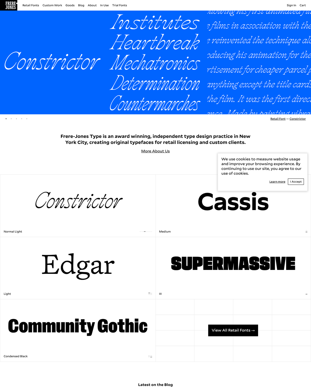
Three blessed bold-editorial / typographic references were screenshotted and read as images before any rebuilding — the step skipped the first time. Their shared traits: extreme scale contrast (~8×), full-bleed committed colour, type that crops and bleeds, rigid hairline grids. The original page had a 1.9× ratio with everything inside a 1180px box.

04 — What changedRegister, not decoration
| Change | Rationale |
|---|---|
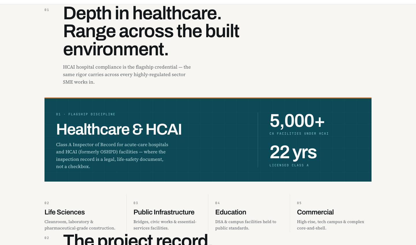
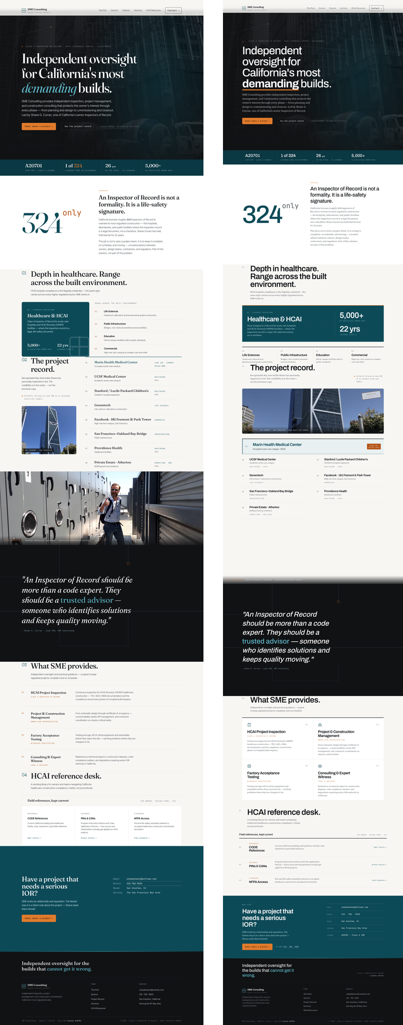
| Display → Archivo | Institutional grotesque replaces the AI-cliché humanist serif. Body → Source Serif 4, deliberately inverting the serif-display/sans-body convention that read machine-made. |
| Orange restricted | The accent was doing five jobs (eyebrow tick, stat emphasis, superscript, CTA, hover). Now one: “take action here.” |
| Competing numerals cut | Service cards had four top-level visual events (icon + ghost numeral + heading + kicker). Numerals demoted to quiet meta. |
| Signature motion | Three heavy structural rules strike across on scroll entry (CSS scroll-driven, from the blessed effect menu). Decorative only — content opacity is never animated, so nothing can hide off-screen. Verified rendering at full 1132px width after scroll. |
| Section rhythm | Uniform 6.5rem padding everywhere read as “a metronome at 60 BPM.” Now tiered. |

05 — Measured resultThree independent scoring rounds
Same critic, same harsh anchors (9 = Linear/Stripe/Pentagram-grade, 6 = competent template), scored blind against each revision. Reported as measured — including the round that bought nothing.
| Dimension | R1 | R2 | R3 (live) | Net |
|---|---|---|---|---|
| Visual hierarchy | 6 | 6 | 6 | 0 |
| Typography | 6 | 6 | 6 | 0 |
| Whitespace | 5 | 5 | 5 | 0 |
| Colour | 5 | 5 | 5 | 0 |
| Emotional resonance | 4 | 5 | 5 | +1 |
The type/register swap bought +1. The third round — paper grain and an inked inspection stamp — bought zero. The critic's words: “largely cosmetic gestures… practically invisible to the overall user experience.” Recorded as a failure, not a feature.
06 — The channel gapWhy judging from code over-scores
The most useful measurement of the session. cross_critic.py scored the HTML/markup channel; the vision critic scored the rendered pixels. Same page, same moment.
HTML / code channel — semantic structure, tokens, markup quality.
Vision channel — the rendered pixels a human actually sees.
Delta 3.1. The tool's own verdict: “Escalate to Victor; do not average.” The markup is genuinely well-built; what it renders into is emotionally inert. This gap is the empirical case for judging pixels over code — and precisely how the first pass over-scored itself.
07 — The remaining blockerImagery, and why it was not faked
“Abandon the pristine, finished-building photography. Replace it with raw, high-contrast field photography — dense rebar mats, MEP rough-ins, active inspections in hardhat zones. The current imagery feels like a developer's brochure; it needs to feel like an auditor's evidence file.”
Three photographs of finished glass towers cannot carry a life-safety compliance brand. No typography fixes that.
AI imagery was deliberately not generated, though the Imagen adapter is wired and available. This site's entire proposition is “the credibility is in the roster — not the brochure copy.” Fabricating field photography of a real inspector's work, on his live site, is the one move that would genuinely damage him. This needs Shane's real photographs — or clearly-labelled placeholders if the direction should be previewed first.
08 — VerificationChecked on the deployed URL
| Check | Result |
|---|---|
| Accessibility | 0 WCAG 2 AA violations — axe-core on the live URL |
| Mobile 390px | 0px overflow at 390 / 768 / 1440 |
| Signature motion | 3 struck rules verified at full 1132px width after scroll — no invisible-content trap |
| Type system live | Fraunces/Inter Tight: 0 occurrences; Archivo + Source Serif 4 serving |
| Heat-map / ΔE fidelity | Not run — no design baseline exists. The engine ΔE-compares a render against a reference design; with no Figma or comp for this page there is nothing to diff against. Stated rather than skipped silently. |
| Component bones | Still fails — pre-existing. Hand-authored CSS rather than the shadcn / Tailwind Plus libraries; true of the whole site. |